


Designing an Android app in Figma is much more than arranging buttons, choosing colors, and creating beautiful screens. A successful app needs a clear structure, a well-thought-out user journey, a consistent visual system, realistic interaction states, and a design that developers can actually build.
After more than nine years in UI/UX design, the workflow has evolved from simply designing screens to thinking about the entire product experience, from the first idea to the final developer handoff.
A typical Android app design workflow can be broken down into these 10 steps:
- Understand the product and requirements
- Research users, competitors, and design patterns
- Map the user flow and information architecture
- Create low-fidelity wireframes
- Build the Android design system
- Design high-fidelity UI with Auto Layout and components
- Design states, edge cases, and responsive behavior
- Create an interactive Figma prototype
- Test, review, and iterate
- Prepare the final design for developer handoff
Here is how each step works in practice.
Step 1: Understand the Product Before Opening Figma
The first step in designing an Android app has nothing to do with Figma. Before creating the first frame, the product itself needs to be understood.
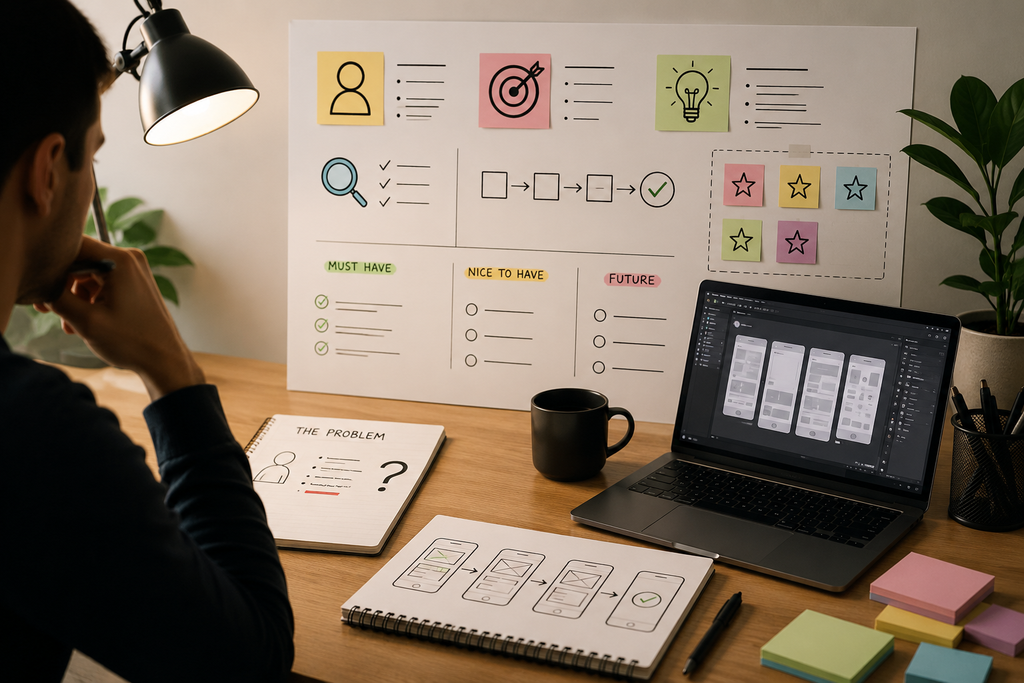
- What problem does the app solve?
- Who will use it?
- What is the primary action?
- What does the business want users to accomplish?
- Which features are essential, and which can wait?
These questions sound basic, but they have a huge impact on the final design.
Start With the Requirements
A client might provide a list such as:
- Login
- Registration
- Home
- Search
- Profile
- Notifications
- Payments
- Settings
It can be tempting to immediately turn every requirement into a screen. That is rarely the best approach. A feature should first be understood as part of a user journey.
Separate Essential Features From Nice-to-Have Features
Another important part of this stage is identifying the MVP.
A project can easily become overloaded with features when every idea is treated as equally important. A better approach is to separate:
- Must-have functionality
- Supporting functionality
- Future functionality
This helps keep the initial experience focused.
A Lesson From 9+ Years of UI/UX Work
One of the most expensive mistakes in product design is polishing a solution before understanding the problem.
A beautifully designed interface built around the wrong user flow is still a bad design.
The earlier the product requirements are clarified, the fewer major changes will be needed later.
Step 2: Research Users, Competitors, and Existing Patterns
Once the product is understood, the next step is research.
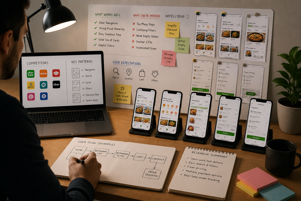
This doesn’t necessarily require a huge research project. Even a focused review of competing apps can reveal valuable information. Open several similar Android applications and look beyond their colors and visual styles.
The goal isn’t to copy another product. The goal is to understand what users already know.
If people have used dozens of shopping applications, they already understand many familiar patterns. The same applies to banking, food delivery, ride booking, social media, productivity, and other categories.
Look for Patterns, Not Screenshots
A screenshot tells very little about the experience.
Instead of asking:
“How does this app look?”
ask:
“Why does this interaction work?”
Learn From Bad Experiences Too
Competitive research should not only focus on good examples.
A confusing checkout flow, difficult registration process, or poorly designed error message can be just as useful. Sometimes the best design insight comes from identifying what shouldn’t be repeated.
Step 3: Map the User Flow and Information Architecture
With the product and research understood, the next step is to structure the experience.
This is where the screens begin to make sense. A user flow describes how someone moves through the application to accomplish a goal.
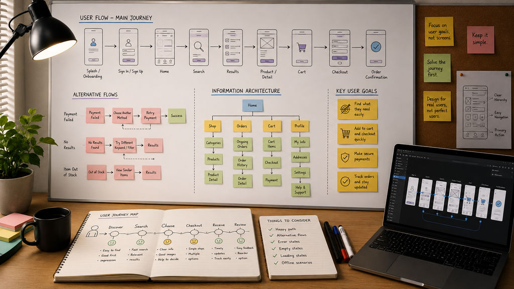
For example, a food delivery app might follow:
Open App → Choose Location → Browse Restaurants → Select Restaurant → Add Food → Cart → Checkout → Payment → Order Confirmation → Track Order
That single flow may eventually become dozens of individual states and screens.
Start With the Most Important Journey
Every application has a primary action. It might be booking a ride for a ride-booking app. For an e-commerce app, it might be completing a purchase.
For a social application, it might be creating or consuming content. That primary journey deserves the most attention. Map it from beginning to end before spending too much time on secondary features.
Information Architecture Comes First
Before deciding exactly where buttons and cards should go, determine how information is organized. A clear information hierarchy makes the eventual interface much easier to design.
The general rule is:
First decide what belongs together, then decide how it should look.
Step 4: Create Low-Fidelity Wireframes
Once the user flows are clear, Figma finally becomes the center of the process. The first designs should be low-fidelity wireframes. At this stage, visual polish is intentionally limited. No need to spend time perfecting gradients, shadows, illustrations, or elaborate animations.
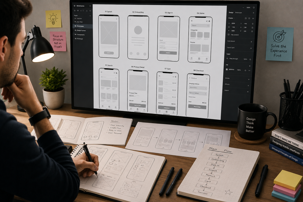
The focus should be on:
- Layout
- Content
- Navigation
- Hierarchy
- Actions
- Spacing
- Information structure
Start With the Core Screens
A typical starting sequence might include:
- Onboarding
- Login
- Registration
- Home
- Main feature
- Detail
- Confirmation
- Profile
- Settings
The exact list depends on the application. The important part is to establish the primary experience first.
Why Wireframing Saves Time
One of the strongest lessons from years of product work is that a five-minute wireframe change can prevent hours of visual redesign.
Suppose the home screen has been fully designed and then someone realizes that the navigation structure doesn’t work. Now every related screen may need to change.
Finding that problem while working with simple wireframes is much cheaper.
Step 5: Build the Android Design System
Before designing dozens of high-fidelity screens, establish the visual language. A design system creates consistency across the entire application and reduces repetitive work.
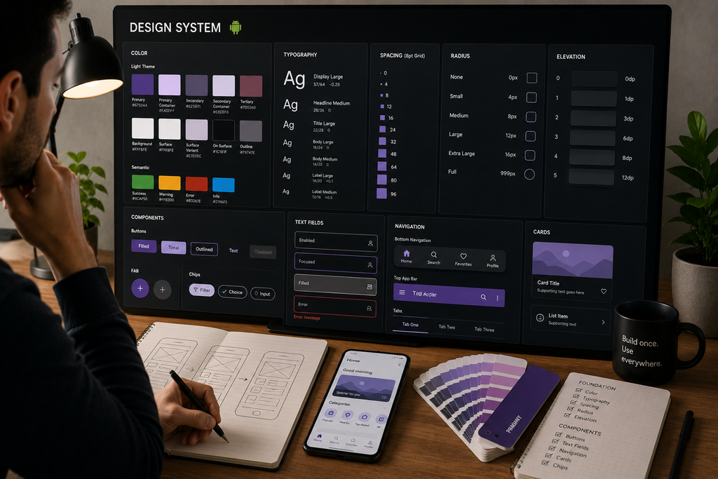
The system usually includes:
- Typography
- Colors
- Spacing
- Icons
- Border radius
- Shadows
- Buttons
- Inputs
- Cards
- Navigation
- Dialogs
- Feedback states
Establish Typography
Create a clear hierarchy for:
- Display text
- Headings
- Subheadings
- Body text
- Labels
- Captions
The exact sizes will depend on the product and platform requirements. The important part is having a predictable system rather than choosing font sizes independently on every screen.
Create a Color System
Instead of scattering dozens of unrelated color values throughout the design, define semantic roles such as:
- Primary
- Secondary
- Background
- Surface
- Primary text
- Secondary text
- Border
- Success
- Warning
- Error
This becomes especially useful when the application later needs dark mode, additional themes, or product-wide visual changes. Figma variables can be used to manage reusable design values and support different modes and contexts. (help.figma.com)
Use Android Design Principles
The design system should also respect established Android conventions. Material 3 provides Android-focused components, theming, accessibility guidance, and adaptive design principles that can serve as a strong foundation. (developer.android.com)
This doesn’t mean every Android app needs to look identical. It means familiar interaction patterns shouldn’t be reinvented without a good reason.
Step 6: Design High-Fidelity UI With Auto Layout and Components
Now comes the stage most people associate with UI design, turning the wireframes into polished screens. But the process shouldn’t simply be:
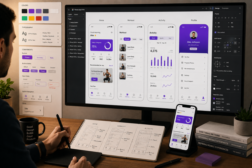
Wireframe > Add colors > Done
There is a lot more happening underneath.
Start With One Important Screen
Instead of partially designing 20 screens, complete one important screen first. This screen becomes a visual reference for the rest of the product. It helps establish:
- Typography
- Color usage
- Card style
- Button style
- Spacing
- Iconography
- Visual hierarchy
- Component behavior
Once the visual language feels right, the remaining screens can be built much more consistently.
Use Auto Layout Wherever Content Can Change
Auto Layout is one of the most important Figma features for designing production-ready interfaces. It allows elements to respond to changes in content and layout rather than depending entirely on fixed positioning. Figma supports horizontal, vertical, and grid Auto Layout flows along with sizing behaviors such as Hug Contents and Fill Container. (help.figma.com)
Consider a button labeled “Continue” Later, the copy changes to “Continue to Payment“
A manually positioned button may require additional adjustments. An Auto Layout button can adapt naturally. The same principle applies to:
- Cards
- Lists
- Forms
- Navigation
- Dialogs
- Bottom sheets
- Notifications
A useful rule is:
Componentize things that repeat, have meaningful states, or need consistent maintenance.
Step 7: Design States, Edge Cases, and Responsive Behavior
This is one of the biggest differences between designing a concept and designing a real application. A concept might show one perfect version of a screen. A real application has many states.
A search screen might need:
Default > Loading > Results > Empty > Error
A payment button might need:
Enabled > Processing > Success > Failed
A form field might need:
Default > Focused > Filled > Error > Disabled
Design the Unhappy Path
The “happy path” is easy. Everything works. The user enters the correct information. The server responds immediately. Payment succeeds. But real users don’t always follow the happy path. That’s why experienced product design spends significant time on edge cases.
Consider:
- No internet
- No search results
- Invalid input
- Server error
- Permission denied
- Expired session
- Failed payment
- Long text
- Missing content
- Slow loading
These states should be visible in the Figma file before development begins.
Think About Different Android Screens
Android is not a single screen size. Different phones and larger devices can provide different amounts of available space. Modern Android design guidance emphasizes adaptive layouts and window size classes rather than relying on one fixed mobile canvas. (developer.android.com)
That means a design should be evaluated for:
- Smaller phones
- Larger phones
- Different aspect ratios
- Larger displays where relevant
- Changing content lengths
Avoid simply stretching every element when more space becomes available. A good responsive layout changes intelligently. For example, a list might become a two-column layout or additional navigation might become visible on a larger screen.
Consider Accessibility
Accessibility should not be treated as a final checklist item. Important considerations include:
- Text readability
- Color contrast
- Touch targets
- Clear labels
- Error messages
- Visual hierarchy
- Different text sizes
- Alternative interaction methods
The objective is not merely to make the app visually attractive. The objective is to make it usable by as many people as reasonably possible.
Step 8: Create an Interactive Figma Prototype
Static screens only tell part of the story. The prototype shows how those screens behave together. Figma’s prototyping tools allow designers to connect screens, create interactions, use overlays, simulate transitions, and build increasingly realistic product experiences. (help.figma.com)
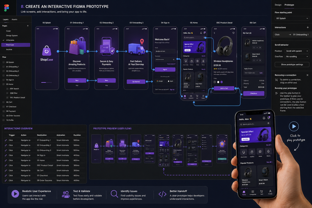
Prototype the Important Journey
There is no need to prototype every tiny interaction. Start with the core journey.
For example:
Login > Home > Search > Detail > Checkout > Confirmation
Then add important interactions such as:
- Bottom sheets
- Dialogs
- Tabs
- Navigation
- Form states
- Loading
- Success
- Error states
Use Prototype Interactions to Discover Problems
One of the advantages of prototyping is that certain problems become obvious only when the design is moving. A screen may look perfect in isolation but feel confusing when transitioning from the previous screen.
A button may look obvious but feel misplaced when actually navigating through the flow. That is why prototyping isn’t just for presenting the final design. It is also a design tool.
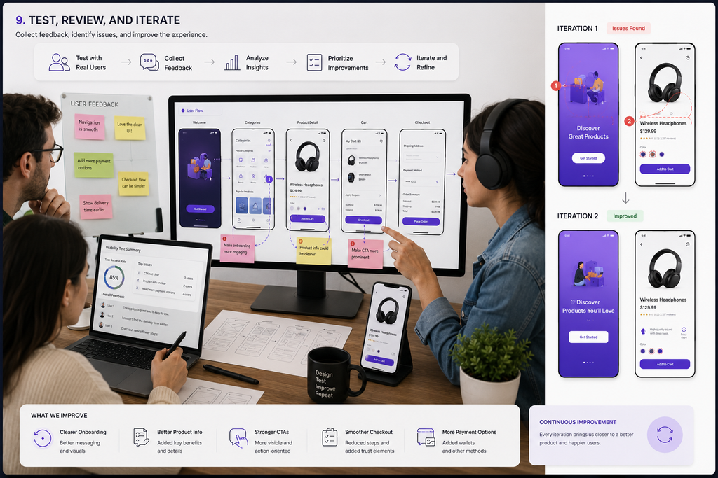
Step 9: Test, Review, and Iterate
A design should not be considered finished simply because it looks good. It needs to be tested. The testing process doesn’t always require formal usability studies. Even watching another person attempt a simple task can reveal assumptions that were invisible to the designer.
Test With Real Tasks
Instead of asking:
“Do you like this design?”
Give someone a task:
“Imagine you want to book a ride to this location. Show me how you would do it.”
Then observe. Don’t immediately explain where to click. See where they naturally go.
Ask Better Questions
Useful questions include:
- What would you tap first?
- What do you think this button does?
- What would you expect to happen next?
- Was anything confusing?
- Could you complete this task without help?
- Was anything difficult to find?
These questions provide much more useful feedback than asking whether someone likes the visual design.
Separate Preference From Usability
Not every piece of feedback means the design is wrong. Someone might dislike a particular color or icon while still being able to complete the task easily. That’s different from a user saying:
“I couldn’t find the button to continue.”
The first may be personal preference. The second is a usability problem. Professional design requires knowing the difference.
Step 10: Prepare the Final Figma File for Developers
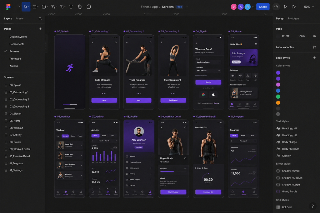
The final step is developer handoff. This is often underestimated. A designer can create an excellent interface, but if the Figma file is messy or important behavior is undocumented, developers may still struggle to implement it accurately.
Clean the Figma File
Before handoff, check:
- Frame names
- Layer names
- Components
- Variants
- Variables
- Typography
- Colors
- Spacing
- Assets
- Prototype connections
- Screen states
Remove unnecessary experiments and make sure the current version is obvious.
Document Important Behaviors
Not everything is obvious from the design. For example:
“The Continue button remains disabled until all required fields are valid.”
Or:
“If payment fails, preserve the entered information and allow the user to retry.”
These details should be communicated.
Use Figma Dev Mode
Figma’s Dev Mode provides developers with tools for inspecting designs, viewing measurements and properties, comparing changes, and working with design specifications. A good developer handoff therefore isn’t simply:
“Here is the Figma link.”
It is:
“Here is the system, these are the components, these are the states, this is how the interaction behaves, and this is the version ready for development.”
That level of clarity can save both designers and developers a significant amount of time.
My Final Android App Design Checklist
Before considering an Android app design ready for development, a final review helps catch the small details that are easy to miss.
UX
- Is the primary user journey clear?
- Is navigation easy to understand?
- Are primary actions obvious?
- Are empty states designed?
- Are loading states designed?
- Are error states designed?
- Can users recover from mistakes?
UI
- Is typography consistent?
- Is spacing consistent?
- Is the color system consistent?
- Is visual hierarchy clear?
- Are components reusable?
- Are icons consistent?
- Is text readable?
- Is contrast sufficient?
Figma
- Is Auto Layout used appropriately?
- Are components organized?
- Are variants logical?
- Are variables useful?
- Are layers named?
- Are pages organized?
- Does the prototype work?
Android
- Does the interface respect familiar Android patterns?
- Does the layout adapt to different screen sizes?
- Are touch interactions comfortable?
- Are accessibility considerations included?
- Have different content lengths been considered?
Development
- Are assets ready?
- Are important states documented?
- Are interactions clear?
- Are specifications understandable?
- Is the latest design obvious?
- Can a developer understand the intended behavior?
Final Thoughts
After more than nine years in UI/UX, the biggest lesson has been that great Android app design is not just about beautiful screens. It starts with understanding the product, the users, and the journey they need to complete.
Over the years, the process has become much more focused on solving problems early, building reusable systems, considering real-world states, and testing before finalizing the design.
Figma is the tool, but thoughtful UX decisions are what make the final product successful.
Understand the problem, design the experience, test it, improve it, and only then polish it.
FAQs
Yes. Figma is excellent for Android app design, offering wireframing, UI design, components, Auto Layout, prototyping, collaboration, and developer handoff tools.
Start with a common Android mobile frame, then test your design across different screen sizes to ensure layouts, content, and interactions remain flexible.
It depends on complexity, features, and screen count. A simple app may take days, while complex products can require several weeks of design work.
Absolutely. Auto Layout helps create flexible interfaces that adapt to changing content, making buttons, cards, forms, lists, and layouts easier to maintain and scale.
Yes. Figma can connect screens, simulate interactions, create transitions, and demonstrate important user flows, making it useful for testing an Android app before development.
